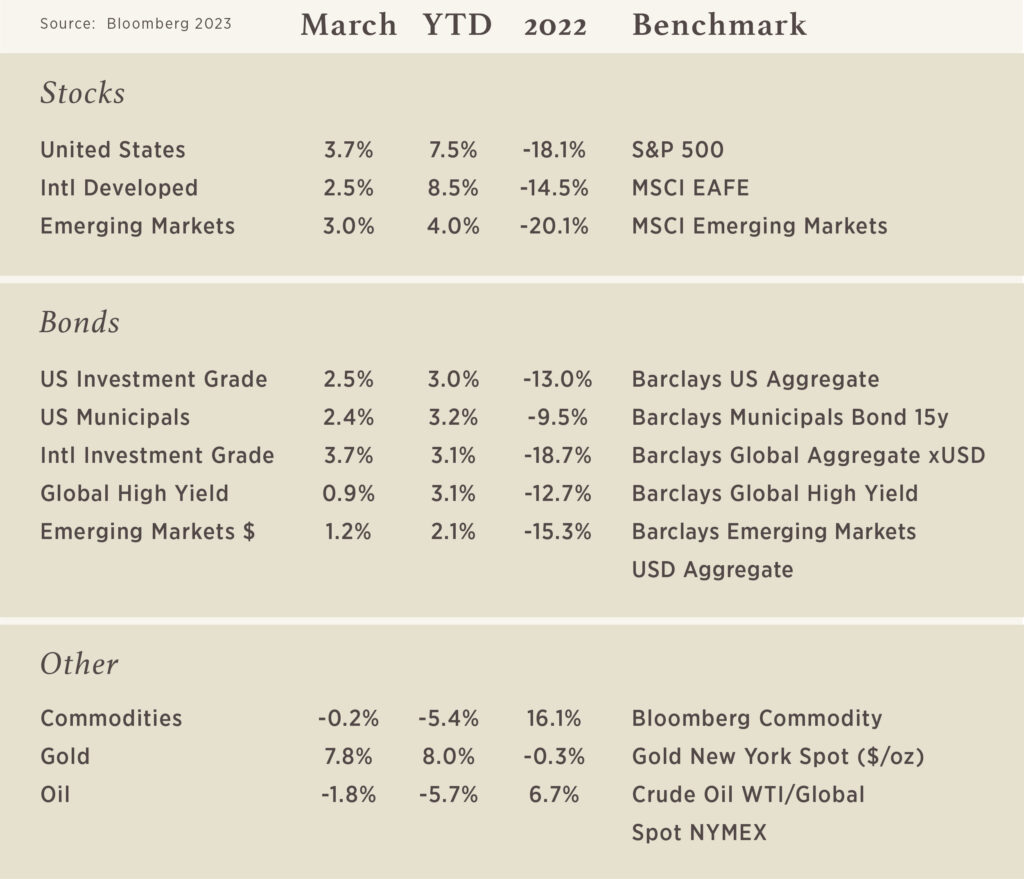
Chart of the Month
If you are a person that likes a thrill, this chart of a 2-Year US Treasury is for you! This shows how 2-Year rates have changed over the past 2 months and it has an uncanny resemblance to a roller coaster – slowly climbing to its peak before the thrilling plummet and following ups and downs. The only thing this chart does not have is a loop, although we could imply that this chart does not exist without Fed and Government actions coming “full circle.”
Why does this chart matter? The 2-Year Treasury is the market’s most indicative signal as it relates to the Federal Reserve’s monetary policy. March 2023 marked the 1-year anniversary of when the Fed first began hiking interest rates this cycle to crimp demand and slow inflation. They have hiked an equivalent of 4.75% in this first year. This quick Fed response brought about some challenges the market continues to digest and some high-profile bank failures (Silicon Valley, Signature Bank, and Credit Suisse) are at the top of the list. The result of these recent events has led to the roller coaster scenario shown in the chart where the market has rapidly repriced what they expect the Fed to do for the remainder of this year and whether additional cracks will begin to emerge.

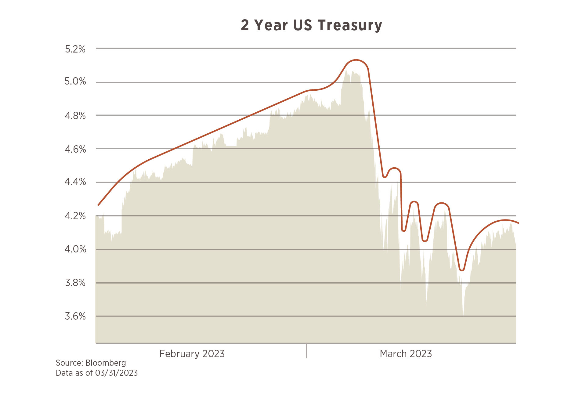
What Keeps You Up at Night

There are many things in our lives that make it difficult for us to sleep, but concerns about our financial future can keep us up long into the night. The good news is we have information and tools to address many of life’s challenges. Please take a minute to review the topics and related questions. Check off the items that you have concerns or questions about right now.
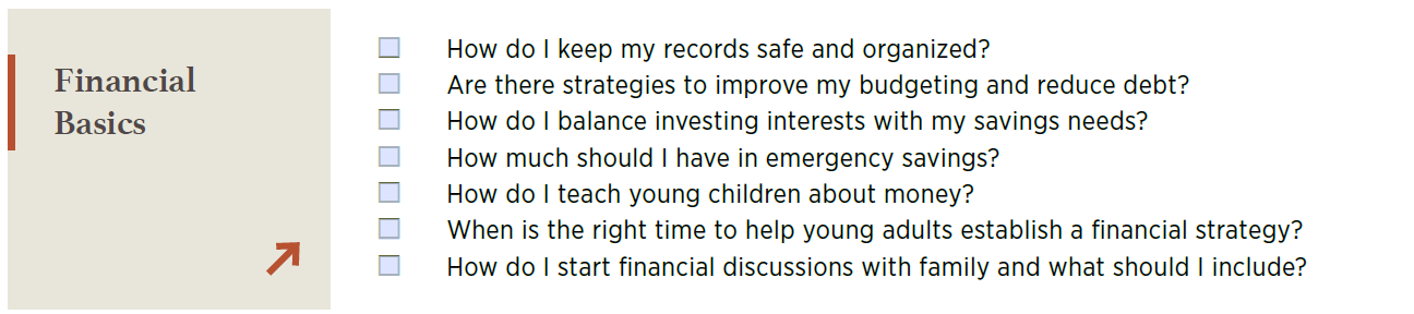
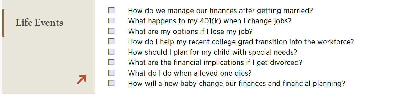
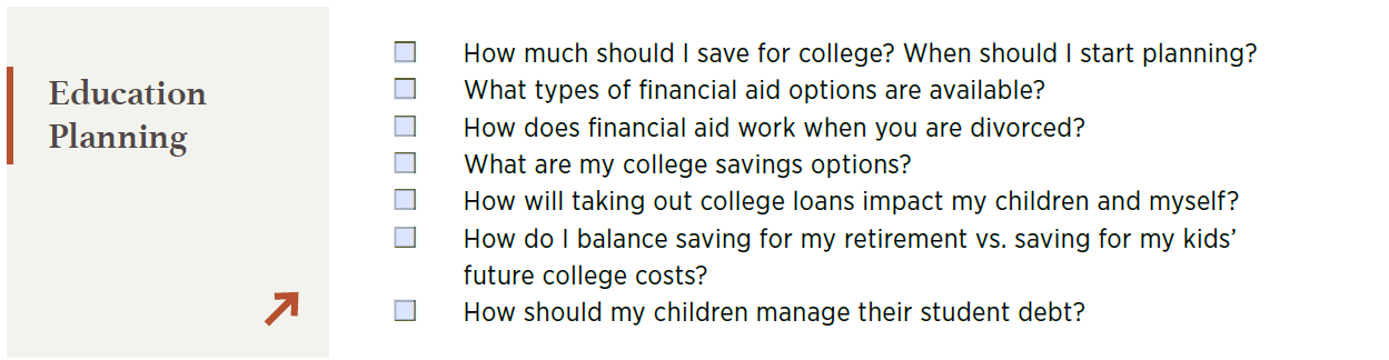

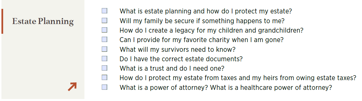
Contact us today to discuss your concerns and create a plan designed around what matters most to you.